Rebuilding trust in a field service app rated 4 out of 10
How a focused user study turned a failing enterprise tool into a prioritized, shipped roadmap — without breaking six other products that shared its foundation.
- My role
- Lead UX Designer & Research Lead
- Team
- 5 (I led research; 1 domain expert, 3 observer-analysts)
- Users
- 8 field engineers · Southeast Asia & South America
- Outcome
- Login, time reporting & UI improvements shipped; research cited in a VP-level product decision
01
The challenge
A global packaging manufacturer ran its field service operations on a heavily customized version of our mobile work order app. The engineers who used it every day to start jobs, track work, and report time had rated their satisfaction 4 out of 10.
That number was the problem I was asked to explain. Not a single broken feature — a business-critical tool that thousands of field engineers depended on, and most of them didn't trust it.
field engineer satisfaction at the start of this study
The functionality was all there. The app could do everything it was supposed to. So the interesting question wasn't "what's missing?" — it was "why does a capable tool feel this bad to use?"
02
My role
I led this end to end. I owned the research strategy, moderated every interview, and drove the synthesis into design direction that engineering and product then built.
What I owned
- Research strategy and interview script
- Moderating sessions across two global regions
- Synthesis, personas, journey mapping, and prioritization
- Translating findings into design decisions and influencing the roadmap
Who I worked with
- A team of five (I led; one program manager as domain expert; three UX colleagues as observers and analysts)
- Product management and engineering — who I had to influence, not instruct, since the changes touched shared platform code
- Customer and internal leadership, who I presented findings and trade-offs to
03
How I approached it
I kept the method lean on purpose. Eight engineers, virtual interviews, over roughly a month including preparation.
- 1
Prepare
Mapped the domain, gathered known pain points, and got a walkthrough of the live solution from a consultant. Built an interview script covering who the user is, usability-focused questions, and follow-ups on known problem areas.
- 2
Interview
Eight engineers across Southeast Asia and South America. I adapted away from the script when I needed to: some sessions had language barriers, and some engineers showed up with their own notes and slides because they cared this much about being heard.
- 3
Synthesize
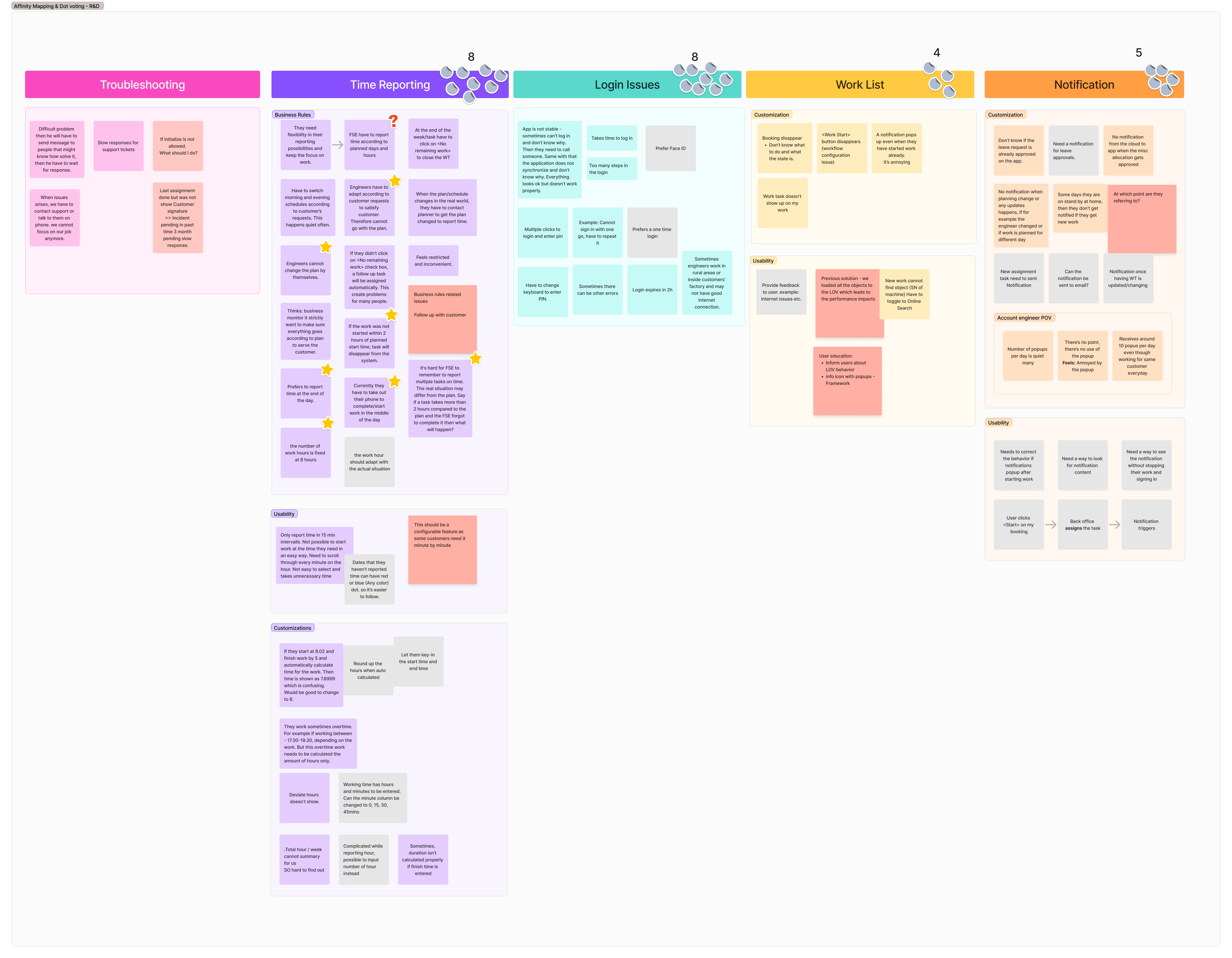
Affinity mapping, theme frequency analysis, dot voting with stakeholders, journey mapping, then design principles and user stories.
Electrical Engineer
10 yrs · Southeast Asia · Champion user
Mechanical Engineer
7 yrs · Southeast Asia · Champion user
Account Engineer
12 yrs · Southeast Asia
Account Engineer
10 yrs · Southeast Asia
Service Engineer
South America
Electronic Engineer
6 yrs · South America
Service Engineer
5 yrs · South America
Electrical Engineer
7 yrs · South America
04
What surprised us
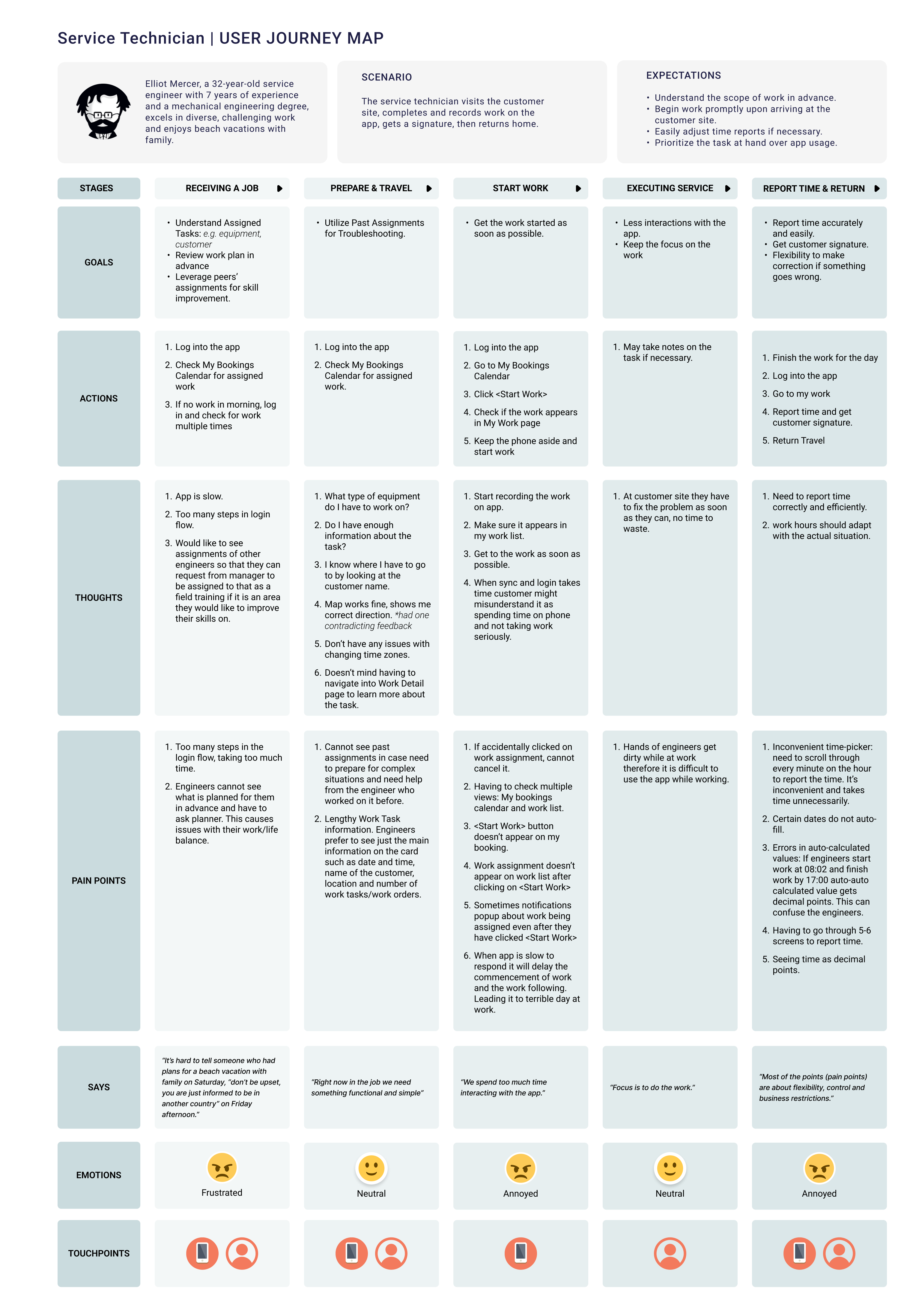
We assumed there was one user.
We learned there were several. Site-based engineers, non-site-based engineers working across many customers, and account engineers managing a group — each with a slightly different journey. Designing for an average user would have missed all of them.
We assumed everyone was frustrated.
We learned the newer engineers were the frustrated ones — still comparing the app to the previous tool. Engineers who'd used it for years had made their peace and reported far fewer concerns. Satisfaction wasn't uniform; it was a curve.
The real surprise: Most frustration didn't come from the app failing. It came from two things we hadn't framed as UX problems at all — the app not giving engineers visibility into their own work allocations, and restrictive business rules introduced through customization that stripped away flexibility they used to have.
05
What was really going on
When I clustered the findings, the long list of complaints collapsed into a few systemic causes. Underneath almost all of them was one thing: the engineers had stopped trusting the system.
Underlying cause
Lost trust
Friction in the moments that matter most.
The highest-frequency daily tasks — logging in, finding and tracking work, reporting time — were the slowest and most painful. Login alone came up again and again: too many steps, having to switch the keyboard just to enter a PIN, sessions expiring after two hours.
Weak feedback.
The system rarely told engineers what was happening. No clear notification when plans changed or leave was approved. Blank screens during delays with no indication anything was loading. When something failed, the only path was to call support and lose focus on the job.
Cognitive overload.
Engineers had to remember too much and navigate too many steps — minute-by-minute time pickers, decimal-hour formats they found unreadable, popups stacked on popups.
I want to log in to the app quickly and easily, so that I can start my work without a delay.
06
The decision that defined the project
Login wasn't just slow. It set the tone for the engineer's entire day.
Engineers told us the long login process soured their mood before work even started. Worse, it cost them with their own managers — some supervisors saw them standing around on their phones and assumed they hadn't started working, when in reality they were stuck fighting their way through the login flow. A usability problem had become a reputation problem.
So I made a call about where to focus: fix trust in the high-frequency core workflows first — login, time reporting, work visibility — rather than chase the long tail of individual complaints. That reframed the conversation with product and engineering from "fix these bugs" to "redesign the experiences engineers live in every day."
07
The hard calls
Every recommendation ran into the same constraint: the app was one of several enterprise products built on a shared mobile framework, spanning different business domains. I couldn't just remove or replace something for one customer — a change here could break six other apps with completely different needs. The senior work wasn't proposing the fix. It was finding a fix that solved the engineer's problem without breaking everyone else's.
Login
Problem
Constraint
What we shipped
- A configuration option to remove the PIN from the login steps, instead of removing it for everyone, so customers who needed it kept it
- Biometric authentication as a device-level layer on top of standard login
- Auto re-authentication: if the app is killed by the user or terminated by the OS, it relaunches and logs the engineer back in automatically (a deliberate log-out correctly still requires manual login)
- Confirmation that SSO is a one-click process.
Outcome
Time reporting
Problem
Constraint
What we shipped
Outcome
This was picked up in particular by the user research [we] did with [the customer].
08
What I deliberately left out
A senior story is as much about what you don't build. The most-requested item from engineers — full visibility into upcoming and future work allocations — I recommended against, and the customer agreed.
Giving engineers that level of visibility would have let them influence the schedule, which sounds good until you realize it undercuts the optimization logic the whole planning system runs on. The customer's management also didn't want engineers self-planning their own field training. So we made a joint, deliberate decision: cut it. We improved the calendar and card views for genuine usability gains instead.
09
What shipped
Login & security
ShippedConfigurable PIN removal, biometric auth, auto re-authentication, one-click SSO.
Time reporting
ShippedUser-level configurable picker interval that persists across sessions; credited in a VP-level product decision and released the following cycle.
Declutter & simplify the UI
Shipped- Refreshed the overall aesthetic to align with the company design system (color, typography, icons), made configurable through an appearance tool so it never broke white-labeling across the native apps
- Optimized the card layout for this app without breaking the shared component used by apps in other domains
- Made the landing page configurable per user, so engineers can open straight to their most-used page and skip extra navigation.
User feedback & error handling
In progressClearer error messages and loading animations delivered. More advanced states held back while the platform completed its technology migration.
Work allocation visibility
Shipped (scoped)Calendar and card views improved; deeper visibility deliberately scoped out with customer agreement.
Notifications
ConceptDesigned but not yet built. Honest status: this is where the next phase picks up.
10
The impact beyond the screens
The study did more than produce a backlog. It changed how the organization treated this work.
It moved the team from anecdote to evidence — a shared, structured understanding of the problems, prioritized. It reframed the narrative from "fix individual bugs" to "redesign the core flows," because the data showed these were systemic, not edge cases. It reached leadership — the findings were recognized as strong work and taken into wider planning conversations. And it established a repeatable pipeline I could reuse: interviews → synthesis → prioritized actions → stakeholder alignment → delivery.
Before
- 4/10 satisfaction
- fragmented workflows
- low trust
- reactive issue handling
After
- clear problem definition across core journeys
- prioritized, shipping roadmap
- cross-team alignment
- UX informing product decisions at VP level
11
What I took away
A few things stuck with me from this one.
The problems that hurt most weren't the rare ones — they were the small frictions in tasks engineers did every single day. A few extra seconds at login, multiplied across every morning, became an emotional and even reputational cost.
In a platform that serves many customers on shared code, the hard part is rarely the idea. It's designing the fix so it solves one user's problem without quietly breaking everyone else's. Configuration over removal, user-level over framework-level — those were the moves that let us actually ship.
And the strongest research outcome isn't the report. It's a senior leader, months later, pointing back to your study as the reason something got built.
A capable system can still fail its users. This study turned a 4/10 experience into a prioritized, shipping effort to rebuild trust in the workflows engineers live in every day.
In line with confidentiality obligations, no product interface screens are shown here — client and product names have been anonymized, and only anonymized research artifacts are included. I'm happy to walk through the final UI work directly during an interview.