Effi — Building a Mortgage Broker Platform as Its First Designer
Founding / first product designer · 2019–2021 · concept → MVP → market release
Built at iTelaSoft (the growth-stage studio building Effi), in close partnership with Effi's founder/CEO and our CTO (iTelaSoft's CEO).
- First
- designer on the product
- 5 → 20+
- team, across 3 countries
- 80%
- lift in lead response (SMS assistant I designed)
- $1.2M
- seed raise (2023) on these foundations
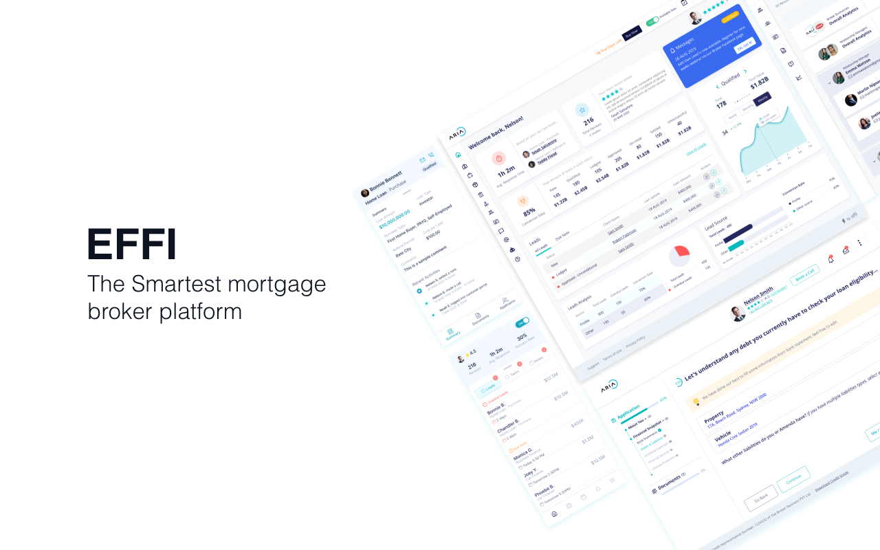
Screens are abstracted to protect Effi's IP — this shows how the design got made, not a full screen tour.
01
The opportunity
Mortgage brokers run complex businesses on a stack of disconnected, legacy tools. Effi's founder had a clear vision — one platform for the whole broker–client lifecycle — and real research behind it.
What it didn't have yet was a designer. I was the first, and effectively the only one.
02
My role
I turned a founder's vision and research into a shippable product, owned the end-to-end experience, and kept design quality intact as the team grew 4x.
The thing I'm proud of isn't a screen — it's becoming the kind of designer a founder can hand the whole experience to.
03
Working with the founder — understand, then push
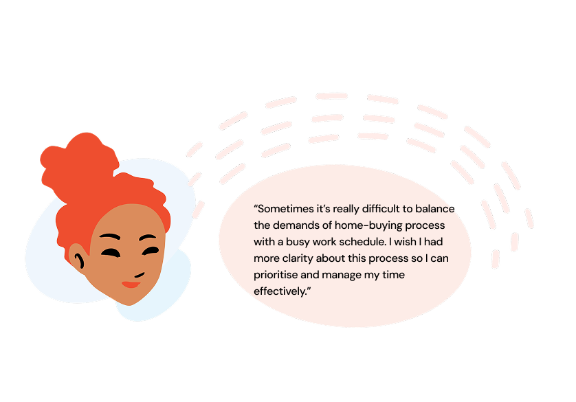
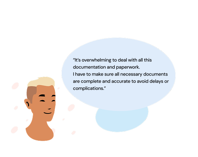
I sat close to the founder and CTO, and earned their trust two ways: understanding the why behind every idea before reacting, then challenging it openly when the experience could be better. When I disagreed I came with reasoning and a quick alternative, framed around the user — so pushback landed as extending the vision, not resisting it. To keep us aligned as scope grew, I distilled the product into three goals we used as real tie-breakers: cut admin overhead, kill tool-switching, design for scale.
Cut admin overhead
Kill tool-switching
Design for scale
04
Four decisions where that paid off
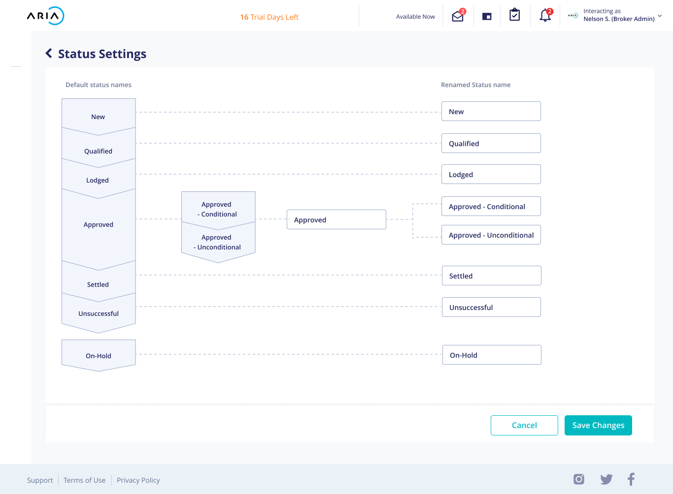
Configurable pipelines, not ours
Challenge
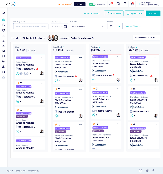
We shipped fixed pipeline statuses; testing showed brokers use their own language for their own stages, which created confusion.
Resolution
Instead of defending the design, I treated it as a disproven hypothesis and made the case for letting each business configure its own statuses — plus a view brokers already trusted.
One platform, not a suite
Challenge
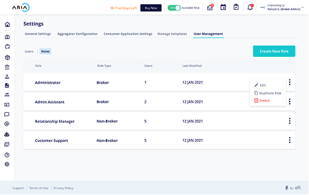
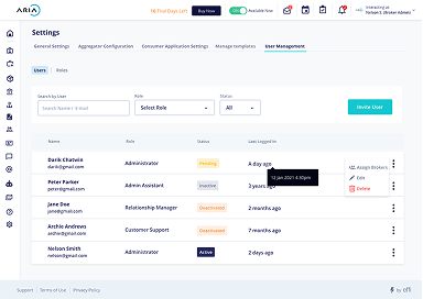
As I designed a separate admin product, the seams showed — the same person is often admin and broker.
Resolution
I raised it early and worked with the CTO to fold administration into the main platform via role management — one coherent system instead of separate tools.
White-label, with guardrails
Challenge
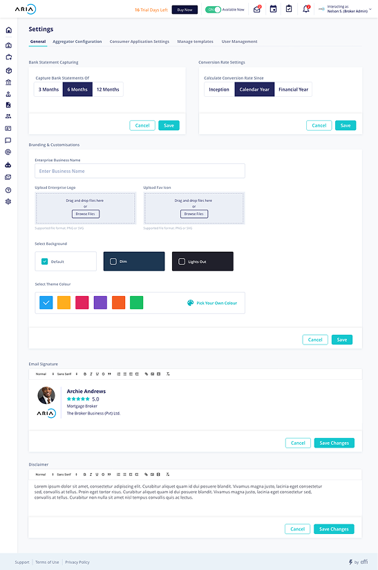
The customer was often the broker business, which carries its own brand — and the team leaned toward giving customers full control of the UI theme, which would break intended behaviors and accessibility.
Resolution
I pushed back and proposed predefined modes — light, dark, dim — where a business picks its brand color, applied only to a defined set of components I scoped with engineering. Brand expression without breaking the experience.
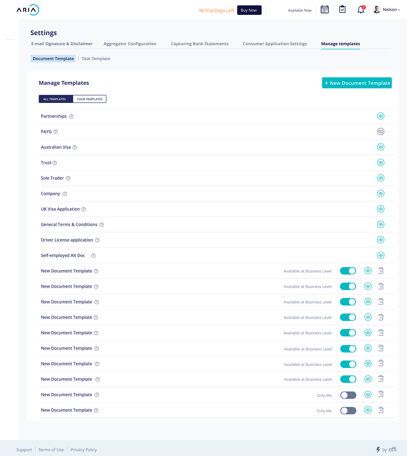
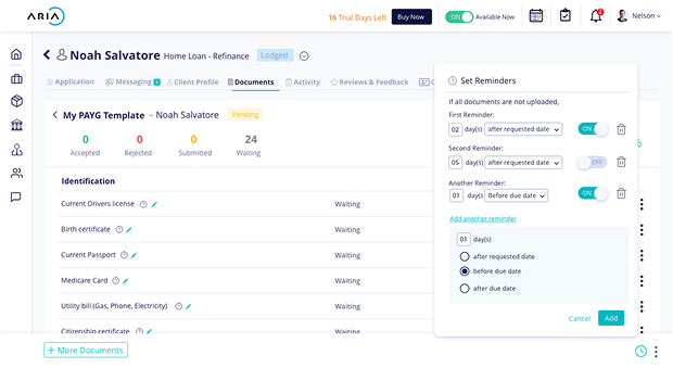
Document collection that fit how brokers already worked
Challenge
Brokers were collecting client documents over email and sorting them into folders on their own computers.
Resolution
Instead of just designing a collection feature, I questioned that workflow and built reusable document templates that mirrored the folder mental model brokers already had — configurable at admin or user level to match each business.
05
Owning design so it scaled
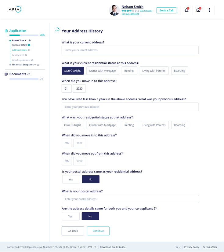
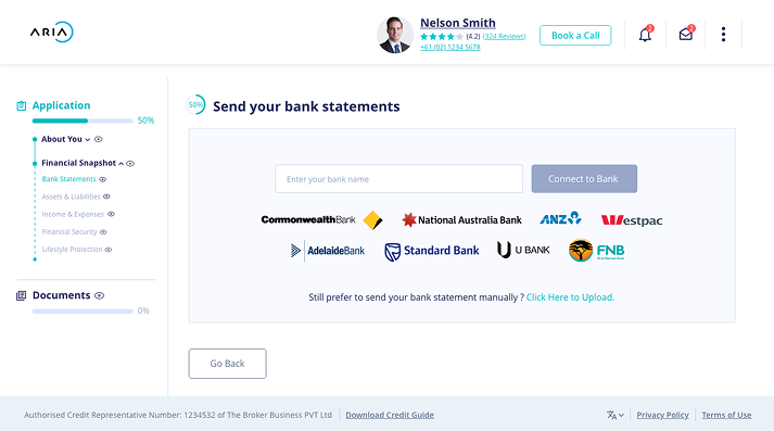
By the end, design couldn't depend on me touching every pixel. So I built things that let others make good calls without me: a shared set of experience principles as a decision filter, the first design-system foundations (and a design intern to help grow them), and a lightweight UX cycle embedded in each engineering epic. I stayed close enough to keep raising the bar through testing — collapsing an over-built detail view and simplifying navigation after users told us to.
06
Design process
I ran a Double Diamond process for each main epic rather than once for the whole product. Applied per epic, it mapped naturally onto the team's Agile delivery — diverge to understand the problem, converge to define it, diverge to explore solutions, converge to ship — with each epic's feedback feeding the next.
- 01
Discover
Diverge · problem space
Synthesized the founder's user interviews and market research, plus my own secondary research into broker workflows, regulation, and competitors to close the domain gap.
- 02
Define
Converge · problem space
Personas, ecosystem and journey maps, a sharp problem statement, and the epic's goals tied back to the three product principles.
- 03
Develop
Diverge · solution space
Information architecture, low-fi wireframes, hi-fi designs and interactive prototypes; explored multiple directions before committing.
- 04
Deliver
Converge · solution space
Usability testing, engineering handoff, and ship — then real-usage feedback fed straight into the next epic's Discover phase.
Design + dev ran in lockstep: the Double Diamond sat inside the team's Agile sprints, so design happened with engineering per epic rather than upstream of it.
07
Outcome
By the time I left in 2021, the entire product was designed end to end — through a 2020 soft launch and 2021 release — and the designers who followed extended and refined it against feedback rather than reshaping it. Several concepts I designed and prototyped shipped after my departure, including conveyancing and settlement services and an AI-powered SMS scheduling assistant that went on to lift brokers' lead response rate by 80%. Those prototypes also helped align stakeholders on the product's direction — and built on these foundations, Effi raised $1.2M in seed funding in 2023 to deepen its technology and expand across Australia and internationally.
She designed, wireframed, and created our company's entire UI and UX for Effi nearly by herself — always with deep thinking on why she designed a workflow the way she did.
08
What I took from it
Understanding the vision deeply is what earns you the right to challenge it. Treat your first design as a hypothesis, not a position — and build the assumption you're wrong into the product through configurability. Owning design at a startup is less about doing all the design, more about making good design inevitable for everyone around you.